St. Mark’s School VLE
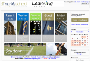
Users can access the learning platform from the schools website. Once on the school’s learning platform, users will be greeted with five tall buttons, approximately 1:3 ratio tall providing access to the Parent Space, Teacher Space, Governor Space, Guest Space and Subject Space.
There is a ‘wide-angle’ button running along the bottom of the five buttons that goes to the Student Space.
All links are also replicated in text format underneath the Student Space button with additional links to Homework Reporting and My Moodle course page.
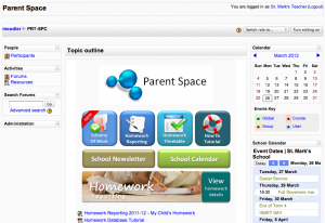
The Parent Space presents information to parents in a straight forward and simple manner. Parents can access Scheme of Work, Homework Reporting, Homework Timetable and a quick Tutorial on how to use the Space.
In addition to this, the VLE also links parents to School Newsletter and School Calendar on the website.
The theme is fluid so maximising the browser window does give user an expanded view of the VLE.
On the right column of the Parent Space, the school presents a feed from Google Calendar containing Event Dates allowing parents to easily download and add events into their own calendar if they need to.
The use of blue, teal, lime green and beige is in keeping with the overall colour palette of the VLE. This consistent colour scheme is used throughout the learning platform.
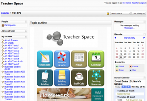
Moving on, we have the Teacher Space, where teachers are allowed to work collaboratively, communicate and share information and best practices among themselves.
There is a grid of 2 by 4 buttons on the middle section containing links to different resources and functions. Here the teachers can find links to Messages, Moodle Tutorial, News, Calendar, Daily Briefing, Briefing Archive, Staff Cafe and Teaching Resources.
As with the Parent Space, there is a button that goes to Homework Reporting allowing teachers to add homework details for students of which parents also have access to.
The clean and white background brings out the colours of the buttons and draws users to them.
As for the other spaces, we have chosen to focus on the Subject Space and the Student Space. Let’s start with the Subject Space.
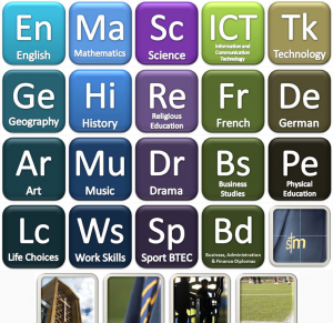
Here is what the students would like to call the Subject Wall and its easy to see why. There is nothing but access to subjects through the use of an array of buttons in a 5 by 5 grid forming a virtual ‘wall’ with brick like layout.Both students and teachers can access the Subject Space for teaching and learning.
For teachers, it would mean easier access to all courses taught as these would be listed under the same subject header.
For heads of department, he or she would have overall access to the subject category and courses.
For students, we see this as an alternative view as they would already have access to My Moodle for the courses they are enrolled in.
The school’s management would also be able to look at the use of the learning platform and the level of engagement with students by department or subjects.
Lastly, we have the Student Space which again follows the layout of the other user focused spaces we have seen, the Parent and Teacher Space but with a slight difference.
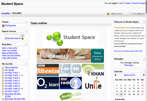
On the Student Space, students can view their homework details, access the different areas of learning as well as online learning resources such as BBC bite size, Khan Academy and more.
There is also scope to include among other things, access to commercial or subscription based resources that the school has bought into and what better way to highlight this and to allow students to take full advantage of these resource but to put them on the Student Space.
It is also worth mentioning the Chaplaincy Space on the learning platform.
The Chaplaincy Space is accessible from the front page as well as from the Student Space.
This is a well used and frequently update Space used by the Chaplain to reach out to the students, to provide them with the spiritual and pastoral support and information useful to students.
