Dyslexia Action VLE: Clever with Page Width
Dyslexia Action is a national charity focusing on improving lives through education and training, addressing the needs of those living and working with Dyslexia and to provide awareness to the general public. We take a look at the creative work by Xelium in sprucing up the VLE with focus on Accessibility and user friendliness. What you see here is a working prototype of the design with fluid width. Users have the option to set accessibility colour scheme and text sizes as well as search for content or find courses in the top bar. They can also use the horizontal menu which is designed to mimic the one found on the website to access different parts of the VLE, portfolio, training information and official website.
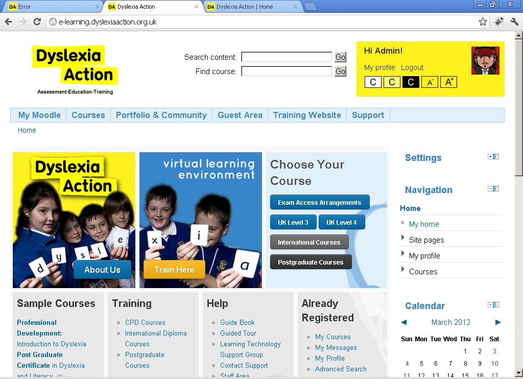
On the front page, there are clearly marked navigational elements that allow the users to find out more about the organisation, access the courses that they are sign up to or to find out more about training options.
View A : Dyslexia Action VLE 1024 pixel Width
On the bottom half of the front page are lists of useful links organised under Sample Courses, Training, Help and Already Registered. These are targeted to specific user groups. For those who have yet to decide and are genuinely interested they may visit ‘Sample Courses’ or ‘Training’ sections to try out the training and to find out more. While those who have already signed up can access the ‘Help’ and ‘Already Registered’ section for support and other features of the site.
While the site is designed to work specifically on 1024 x 768 resolution typically found on tablets such as the iPad, the design is made to flow if the site is opened on screens with higher resolution particularly those with wide screen format.
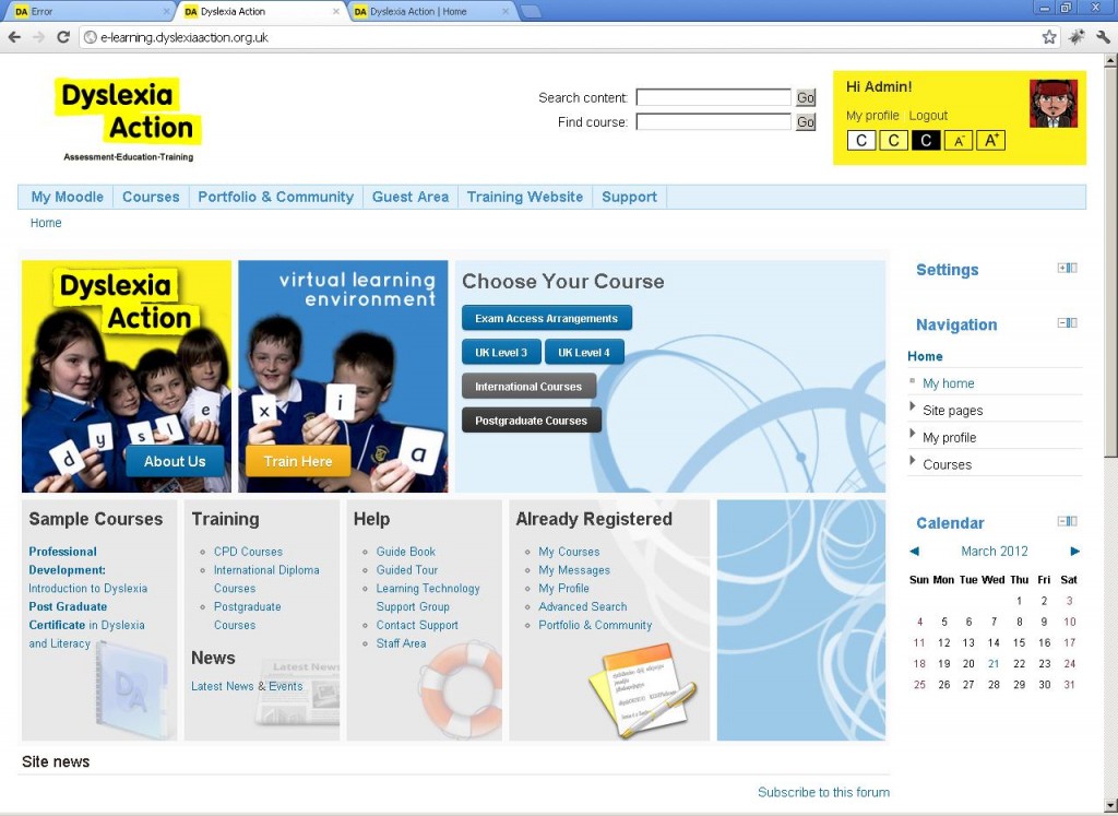
View B : Dyslexia Action VLE 1280 pixel Width
Design elements are fixed and the only varying width is the column to the far right that either disappears when viewed on screen with lower resolution or extend according to width of screen when viewed on wide angle screen. These filler graphic ensures that the layout does not break and flows with the increase in width. Here is another like at the site at higher resolution below.
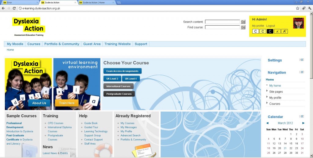
View C : Dyslexia Action VLE 1600 pixel Width
By fixing the size of the graphical elements and width of the columns in the second row, accessibility controls dealing with size of text would not affect the size and placement of the graphics keeping the images and layout consistent and in the right order.
We would certainly be interesting to see the end result of this site once it is ready.
For more information on Dyslexia Action, visit their website here.
To make sure you continue to receive interesting exciting articles at the forefront of learning with technology, remember subscribe to our updates below and follow @ColorMyLearning on Twitter and Like us on Facebook.
You will benefit from a newsletter updates straight to your mailbox from ColourMyLearning on the use of Technology for Teaching and Learning.
Don’t forget to rate the article
