Study Direct: University of Sussex VLE
It is a fact that there will always be pros and cons to every learning platform, be it commercial or open source, but we like to think that if you can marry the need for better end user experience with the tenacity of developers for more features, you can strike a balance and achieve a learning platform which is both feature rich and user friendly.
Let’s take a look at one we discovered that falls perfectly into this category.
Earlier this month, at the MoodleMootIEUK 2012 conference in Dublin, Ireland, we witnessed for the first time, what can only be described as THE dream VLE; a learning platform so friendly and approachable, yet full of wholesome features.
It’s eye opening how a fresh take on things could be, should be and can be, easily likened to the first cup coffee in the morning from your favourite café, brewed from freshly ground beans, roasted to perfection. Simply, inspiring.We are referring to Study Direct, the University of Sussex’s e-learning platform based on the Moodle…that looks nothing like Moodle. We were fortunate to hear from the team behind the project to address some major usability issues on the platform. They took what is typically described by some as a clunky, overloaded, daunting and scary to a whole new level of fun.
We won’t go into the details of the presentation by Stuart Lamour on ‘Fine-Tuning the Moodle Experience’. The presentation gave an insight into how the development team, armed with the goal of improving the user experience of Moodle, gathered input from both staff and students, identified the issues and came up with a big shift in Moodle’s usability.
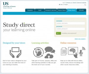
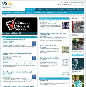
Instead let’s take a tour of Study Direct, to look at the great work and effort from the good people of Sussex’s e-learning team. The Study Direct login page is wrapped together with other internal resources available to the staff and students at university. Other than Study Direct, there is access to Student news portal, Staff news portal, School & Service, Sussex Direct (MLE) and SPLASH (a custom news portal).If you can marry the need for better end user experience with the tenacity of developers for more features, you can strike a balance and achieve a learning platform which is both feature rich and user friendly.
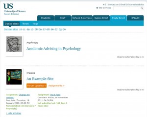
Let’s jump straight into the Study Direct. Upon login, the site defaults to the My Courses page. We see the familiar Moodle URL link to my courses page, what some may describe as an attempt at a dashboard and that is as far as the familiarity goes.
Again, it looked nothing like the Moodle My Courses page that we know.The courses are laid out in a directory format, in alphabetical order and grouped according to academic intake year e.g. 2010-11, 2009-10, 2008-09 and so on. Very appropriate for university courses where course modules are taught over a year.
There is also a thumbnail next to the title of each course where staff can upload a suitable image to represent the course. A feature which Stuart explained was added to give the courses a standard feel.
Courses with activities assigned are displayed with buttons that gives students quick access to these activities e.g. forum updates and assignments to check on the latest post and/or assignment due date.
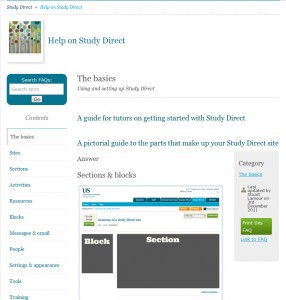
When inside a course, navigating through the topics is easy with the topic headings shown on the side bar. Users can also navigation between topics with next and previous topic headings showing at the bottom right and left respectively.On more advanced courses, such as one prepared by the IT department, appropriately titled Help on Study Direct, expandable and collapsible sub-topic headers are built into the main page area allowing users to navigate frequently asked questions. Users can expand these to reveal the answers without leaving the page.
An optional footer section containing blocks to access course links, library links and people can also be enabled at the bottom of the course page. These allow users to access course timetables, asseessments, past exam papers, assessment deadlines and more on the university MLE and library management system.
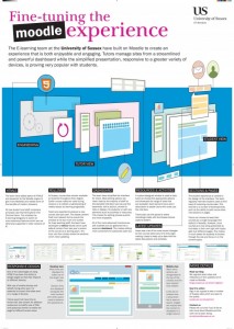
The development team has also produced a single page infographic hand out for those in the University of Sussex requiring a quick tour of the revamped user interface.
The infographic described among other things, the rollover facility for tutors to ‘reset’ and reuse their course in the new academic year and a dashboard that gives staff access to edit a section, choose to hide or display the section or add new elements such as activities or resources.
Those familiar with Moodle will also be all too familiar with the Turn Editing On button that throws up tonnes of icons and options to every section, resource and activity drop down menu and options to manipulate settings and placement of blocks on the side bars.
Study Direct’s use of the dashboard keeps these options to a minimum, only showing one set of editing options for this case, the section the user is adding or editing, making it clearer and easier to add topics, resources and activities.
The team also goes one step further to display the resources and activities in a grid on a custom designed window to make it easier to choose the right resource or activity to choose, complete with tool tips.
To address the infamous Scroll of Death (SoD), a common problem with long courses pages, the team has developed a way for staff to have the option of breaking up a long page into multiple mini-sites each complete with topics pertaining to the course subject. A feature that was also mentioned at the Moodle conference by Martin Dougiamas, the creator of Moodle, to be included in the next release with details found here and the proposal and discussion for paged course format.While most features are core to Moodle, the revamp makes them so much easier to access and apply. The visual appeal makes it fun-ner and more enjoyable to use.
We do have some reservations in terms of what the team has chosen to highlight, much to the influence of the end users. As the focus group were mainly academics and the university uses a separate system to manage past year exam papers and assessments, we see Study Direct as mainly a document and media repository with some forums and basic assignments thrown in. For other establishments, the learning platform will need to make more use of activities such as questions, quizzes and advanced assignments.
So this leaves us again at cross roads, one where functionality and usability diverges, where it seems there can only be one chosen path, usually at the detriment of the other unless of course there is an alternative middle path.
We welcome feedback from the end user camp and the developer camp as well as camp hybrid, people such as the e-learning Development Team at the University of Sussex. Do drop us your thoughts.
Links:
Study Direct: University of Sussex Learning Platform
University of Sussex: E-learning Team Blog
Reference: Fine-tuning the Moodle Experience infographic is property of the University of Sussex, all credits goes to the university and the e-learning team.
For more images of the VLE check out the gallery below:
You will benefit from a newsletter updates straight to your mailbox from ColourMyLearning on the use of Technology for Teaching and Learning.
Don’t forget to rate the article.
