Keep it Simple
“Keep it simple” and “Less is more”, if you hold these mantras to heart, take a look at the designs on this virtual learning environment.
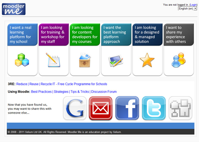
Big image panels dawn the front page with clearly labelled and starkly contrasting colours to show different areas a visitor can continue to. These labels are user oriented, assuming the different reasons why a user would visit moodler.me.uk. The links beneath the 6 panels goes to two other course areas, 3RE (Reduce, Reuse, Recycle IT) an IT recycling programme for schools and Using Moodle, a community page for sharing best practices, strategies, tips and tricks on the use of moodle.
The main panels say things like
I want a real learning platform for my school
I am looking for training & workshop for my staff
I am looking for content developers for my courses
I want the best learning platform approach
I am looking for a designed and managed solution
I want to share my experience with others.
The subsequent pages which are equally simplistic if not easier are shown below:
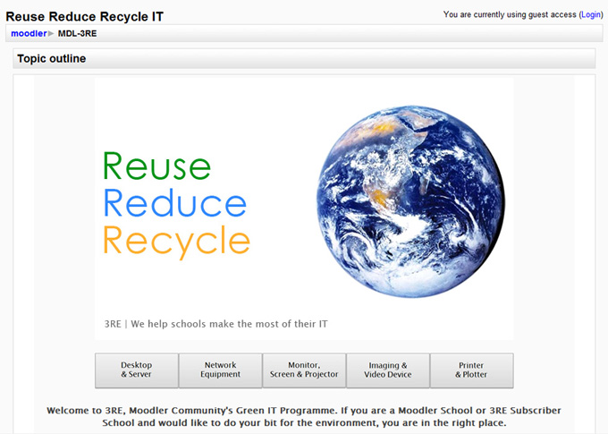
The moodler.me.uk 3RE (Reuse Reduce Recycle IT) is a clean and simple page with plenty of white spaces, clear messages and straight forward horizontal buttons on the bottom.
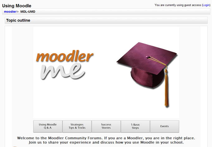
Again, in the same theme as the recycling page, the moodler.me.uk Community Forum is equally impressive.
Take a look for yourself and tell us what you think.
External links:
- moodler.me.uk front page
- moodler.me.uk 3RE
- moodler.me.uk Using Moodle
- moodler.me.uk featured on MoodleNews – A Good Looking Moodle and 5 Basic Steps
You will benefit from a newsletter updates straight to your mailbox from ColourMyLearning on the use of Technology for Teaching and Learning.
Don’t forget to rate the article.
